
Designing an infographic can be an intensive process. Often you are using complex data, in the form of numbers and text, in order to create a visual explanation. These graphics are excellent visual tools for explaining huge amounts of information, where both intricate data and key take-aways need to be explained and transformed in a user-friendly way. So, how does one do this?
1. Data Research
Sifting through information can be incredibly time consuming, yet critical. What is the key information that you are trying to get across? How can it be simplified?
2. Wireframe
Before you start designing, what is the narrative and layout that makes sense to get the story across? The organization and structure of data and text can make or break an infographic. It often helps to create a hierarchy of information, and create a general layout before you start.
3. Illustrate
Create the individual graphics that will make up your infographic. Sometimes this includes trying a variety of different styles, and seeing which make sense in representing the information. In any case, the decision will be guided by the data. It may require a diagram or flowchart to represent a process, a map, or simply showcasing numbers in an interesting way. There will probably be a lot of trial and error here until you find the right style, or look and feel, to your graphics.
4. Feedback
Make sure your information makes sense to the user. This could involve discussing the design directly with the client to work through details in the data, or reaching out to an outside source, to see if the graphics are understandable and clear. It’s helpful to include those who have not seen the data before, to evaluate whether the public is taking away the correct information.
5. Finalize
Make sure your graphics are legible across many different devices, and make your final tweaks.The use of color, typography, and structure contribute to making the piece engaging, so getting these pieces right are just as important as the information itself. The final design is evaluated to make sure it is as clear and simple as possible.
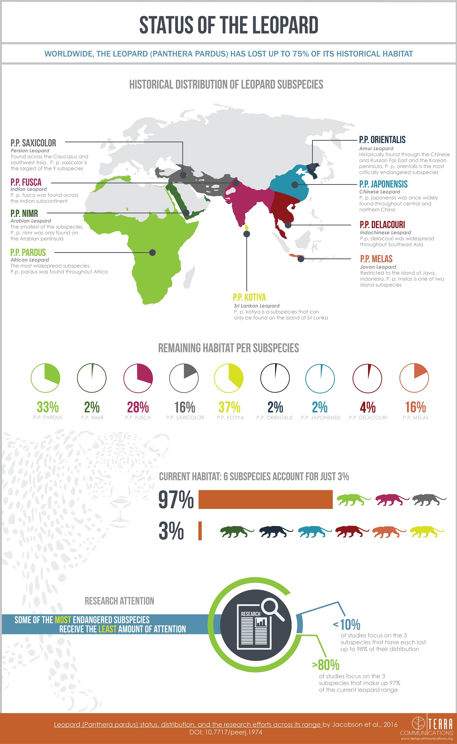
Please see below for an example commissioned to help represent a research paper on Leopard status, distribution, and the research efforts across its range.

This is great 🙂 hopefully will help me make some for my own blog
LikeLike